Changes we made
A young person’s view: The changes we made and why we made them
By Ellen Molnar, Look Again Project Volunteer.
The Look Again Project’s aim is to redesign the Fashion Gallery at The Salisbury Museum, which was last done in the 1980s. Obviously, interior design has changed substantially since then, and the gallery has been almost completely rethought, with a new colour scheme and different mannequins, although the placement of the cases has remained the same.
The project has done a lot of work with young people in coming up with the design of the new gallery. There have been several groups who’ve given their thoughts on the old gallery, and two things almost everyone said was that it was too dark, and the mannequins were creepy. There was also criticism of the captions as being too small and uninteresting, and the carpet. The Look Again team has tried to address all these areas.
Old Costume Gallery, ©The Salisbury Museum collection
Firstly, we considered a new colour scheme for the gallery. The room has to be kept at low light in order to protect the fragile items on display, but we decided that one way of making it seem brighter would be to chose lighter and brighter colours for the walls. Therefore, we went for a light grey as the main colour for the gallery with pops of orange and purple to make the room more vibrant. The colours go well together and were chosen to link to some of the brighter items to go into the new gallery: a 1960s oranges and lemons dress and a purple dress which belonged to a Russian princess.
We chose a grey slate colour for the floor as it goes well with the other colours and isn’t carpet, which many people found odd. Now it is complete, I am able to look round the newly painted gallery and the colours really make a difference. It’s a much brighter and cheerier space.
The captions in the gallery have also been changed. Instead of listing the items in the cases in sometimes confusing jargon, we decided to chose one key angle for each piece: for some that’s an interesting technique, explained to be understandable, and for others that’s a part of the item’s history, its origins or its owners. The captions have been made bigger and will be higher up in the cases so they’re more accessible so more people can learn about the items on display. We’re also aiming to have more detailed information that can be accessed through a QR code for anyone who wants to know more.
Another choice that’s been made about the new gallery is to open the scope of items on display. Previously the gallery had focused just on the history of fashion in Salisbury and the local area, but there are so many fascinating items in the collection that come from further afield that the choice was made to just pick the most interesting and eye catching items in the collection that could be displayed without it being a conservation issue.
Because of this approach the items are going to be grouped thematically, not chronologically as there would be too many gaps, and hopefully it will create a better visitor experience with more interesting things to see.
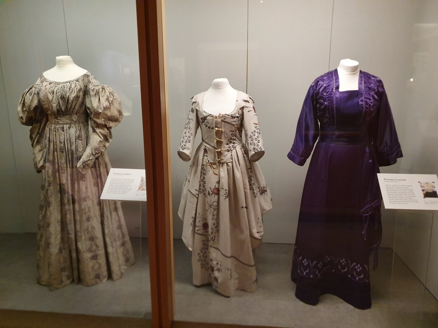
Replica garments in test case, ©The Salisbury Museum collection
Finally, and perhaps most importantly, we dealt with the issue of the mannequins. The existing ones had been much criticised by everyone who’d seen the gallery, the main point being that the painted faces were rather creepy and unsettling, and so we went with headless, understated mannequins which will hopefully not detract from the items on display.
We chose a dark vintage finish to the wood to fit the historical aesthetic of any museum gallery, and having seen them in use in the work room they looked excellent and now we feel that they make the new Fashion Gallery a better place to be.


